What roles colors play in the psychology of a consumer from ads perspective
Facebook Ads is a great way to advertise your products or services online. But how do you convey everything about your brand in a single ad copy and convince your consumers? Thanks to the 20% text rule and limitation of words, this task has only become harder. But luckily, choosing the apt colors for your ad copy can solve this problem. Representation of your brand through the right colors can speak louder than words.
Some Statistics Associated with Colors on Facebook Ad Copies
Before we learn more about the colors and their influence on brands, let us have a look at some statistics to get an idea of the importance of colors and how they can be used.
Changing the color of a Call – To – Action button on your website’s landing page can increase conversion rates by 14.5%.
Purple Color is well – received by 23% of women and close to 0% of men ( Followed by Brown )
Contrasting the color of two links within a single image can increase conversion rates by 60%
Adding a colored border around a Facebook Ad image can double its Click – Through – Rate.
General Colour Preferences of People
Before running a Facebook ad, we decide on our target audience. An ad campaign performs better when the ad copy is tailored to the desired audience. Hence, it is essential to know what type of colors are perceived best by the different types of people.
Please note that this is a general analysis made overall. Since the age of joining is 13 on Facebook, the list below applies to people between the age groups of 13 and 65
BASED ON GENDER
GENDER
PREFERENCES
Men
Bolder Colors and Shades (Colors with Black added)
Ex: Blue, Maroon or Dark Red
Women
Softer Colors and Tints (Colors with White added)
Ex: Pink, Light Blue and Green
BASED ON AGE
AGE
PREFERENCE
(Listed in the order of preference)
Teenagers
Blue, Green and Shades of Red
19 – 24
Purple (mostly women), Blue, Darker Shades of Red, Green (mostly men)
25 – 35
Saturated Blue, Purple or Lavender (mostly women), Green, Shades of Yellow
36 – 60
Mild Blue, Light Purple (mostly women), Bright Green, Grey, Brown Shades (mostly women)
60 + and above
Light Sober Colors and Soft Shades of Blue, Off White, Grey, Brown
Colors and Their Analysis
Each color represents a set of qualities. A brand can use a color that closely matches with their values and products. Let us discuss the different colors and the characteristics interpreted by them psychologically.
RED
Traits associated with this color:
Excitement, Physical, Youth, Bold, Passion, Ambition, Energy, Strength, Love, Power, Determination, Active, Leader, Willpower
Brands that use this color:
Coca – Cola, Red Bull, Virgin Airlines, Pinterest
What it does:
Creates a sense of urgency (For offers)
Triggers appetite and appeal (Fast Food)
Physically stimulates the human body (Movement – Energy)
How it can be used:
Saturated Red does not blend well with the Facebook’s general theme. Hence, avoid using it as the primary color in your ad. However, If Red is your brand color, try using it with a lighter complementary shade to stand out.
You can use red borders or a tinted red backdrop for your ad, to make it more visible in the newsfeed.
You can also use Red to bring attention to certain parts of your ad, such as price, discounts, call – to -action, deadline and countdowns.
Examples

Sorav Jain is a well – known Digital Marketer, who is running a Facebook Ad for his new book ‘Become a Brand’. The first thing we notice is the excellent use of red. The tinted red with white zig zag patterns in the background is not too bright for the eye, but bright enough to pop up. The contrasting white highlights the CTA ‘Buy Now’. Notice how Sorav has worn a white shirt which act as a highlighter in itself. This creates a sense of uniformity, making the book which is also red, stand out.

Air Asia is a popular Airline company that is running an ad for their ‘Free seats’ promotion. They have used a light grey gradient shade on the background and brought focus to their logo and CTA. Like the earlier example, the airhostess is also dressed in red, which blends with the color theme of the ad. This also shows the importance of using the right pictures in the ad copy.
YELLOW
Traits associated with this color:
Optimism, Lightness, Clarity, Non – Seriousness, Warmth, Energy, Happy, Attention
Brands that use this color:
McDonald’s, Lynk, Nikon, Snapchat, Maggi
What it does:
Creates a sense of excitement amongst children (Toys, Fast food)
Showcases Playfulness and fun. This is why yellow is often used in emojis
How it can be used:
Yellow can be an excellent background that can complement almost any color.
If your brand color is yellow, you can use darker tones on the sides and borders, since yellow will help balance the overall color intensity of the copy.
Examples
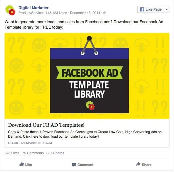
Digital Marketer is a forum that teaches Digital Marketing. Their page is running an advertisement for their Facebook Ad Template. They have used yellow as a light and cheerful background ( using emojis ) to accentuate the otherwise plain focus point. The ad is simple and direct, making it easier for the viewers to comprehend the ad copy.
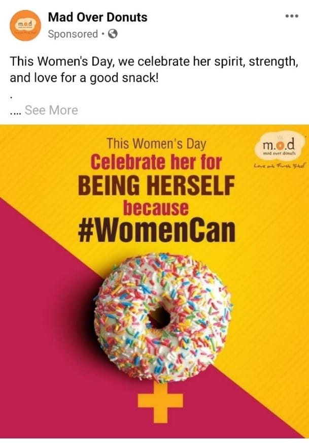
Mad over Donuts is a Donut shop that is running a Facebook ad for women’s day, celebrating womanhood. Although the background is a combination of pink (for women) and yellow, we can see that they have used more of a yellow shade, due to its close association with food and celebration. The Yellow also brings attention to the donut symbolizing feminism, which is our prime focus point.
BLUE
Traits associated with this color:
Trust, Dependable, Reliability, Strength, Peace, Calm, Wisdom, Confidence, Depth, Stability, Courage, Spirit, Perspective, Content, Rescue, Goals, Purpose, Self-sufficient, Modern, Open, Water, Tranquility
Brands that use this color:
Pepsi, Samsung, Oreo, HP, Skype, Intel, Twitter, Facebook, Gap, IBM, Ford, PayPal, American Express, Oral – B, Head & Shoulders
What it does:
Blue exudes a sense of trust, reliability and security (Banks, Communicative platforms like Skype and Facebook)
It can also curb appetite and can stimulate productivity (Energy drinks)
The color also represents liquids, to due its common interpretation as water and water bodies. (Water products, Shampoo, Toothpaste, Mouthwashes)
How it can be used:
It is one of the best branding colors, that is well – perceived amongst all age groups. However, due to the Facebook’s generic theme, this color should be used wisely to make your ad stand out.
Blue can be used for Electronics – based brands, since the color is often associated with technology
Examples

Crucial Memory is a company that designs and manufactures storage devices such as SSD cards. Understanding the association of blue with technology, they have used different shades of blue (including navy blue) in their ad, for their background and font. By using the right shade of colors, they have ensured that the color is not too overwhelming.

Career Launcher is an educational organization, that conducts training for students and professionals, and also prepares them for competitive exams. Notice how they have used blue as their primary color, to convey reliability and productivity and a lighter variant of the same color to highlight the price of the package. The ad also uses red to bring attention to their brand name.
GREEN
Traits associated with this color:
Peaceful, Harmony, Prosperity, Growth, Health, Nature, Safety, Balance, Stable, Positive, Good Judgement, Restore, Sanctuary, Equilibrium, Generous, Clarity
Brands that use this color:
Spotify, Tropicana, Tic Tac, Star Bucks, Vicks (with the mix of blue), Land Rover, Holiday Inn
What it does:
Relaxes and Calms the human mind. Known to be a symbol of peace and affirmation
It is often associated with health and efficiency (Products with Medicinal Value)
Symbolizes growth and well – being (Businesses, B2B)
Provokes thoughts of nature, scenery and environment (Resorts and Hospitality sector)
How it can be used:
If your ad represents eco – friendliness, healthy food and lifestyle, affirmative thoughts and saving time or money (during offers), Go Green!
If you are running campaigns on social welfare or awareness, you can consider using this color since it has a positive appeal to it.
Use Green to highlight any special offers, discounts, sale or promo codes.
Light green works well on backgrounds and dark green works better on fonts and highlighting CTAs.
Examples

Hootsuite is a software specially designed for social media management. The Facebook ad above is for a limited period free trial offer. In this ad, we can see the use of a lighter and darker gradient of green, symbolizing business growth and saving money (free trial).

Green Blender is a Healthy food and recipe subscription box, that sends you original organic recipes and proportioned ingredients. Although their ad copy only uses a picture of ingredients, you find that the general color tone of the picture is green, with fresh green vegetables and a healthy smoothie. This also showcases the close association of the color with good health.
ORANGE
Traits associated with this color:
Friendly, Warm, Cheerful, Enthusiasm, Confidence, Success, Creativity, Instinct, Gut, Spontaneity, Social, Extrovert, Freedom, Impulse, Heat, Caution
Brands that use this color:
VLC Media Player, Nickelodeon, JBL, Bitly, Orange S.A
What it does:
Exhibits Spirituality and Energy, since the color is often associated with natural elements such as sun and fire
Associated with Cheerfulness and hence used in several multimedia related products.
How it can be used:
You can use Orange as a background color if your focus point is in a contrasting color
Orange can accentuate the important parts of your ad copy if used rightly. So, use it in borders, CTAs and Text Highlights
Examples

CoSchedule is a Social Media Management tool and they are running a brand awareness campaign. Their ad copy is minimalistic and clearly worded. The orange background gives a sense of creativity and work enthusiasm, portraying the idea that the software is fun and easy to use.

Zero to launch is a Business Improvement guide course. Unlike the earlier ad copy, this ad uses orange only halfway, highlighting their focus point ‘successful business ideas’. The orange color also helps to trigger productivity, due to its association with human impulse.
PURPLE / VIOLET
Traits associated with this color:
Wise, Wealth, Royalty, Power, Luxury, Magic, Creative, Courage, Imaginative, Fantasy, Deep, Unconventional, Original, Stimulation, Individual, Compassion
Brands that use this color:
Yahoo, Cadbury, Hallmark, Avid, FedEx (with Orange)
What it does:
Psychologically proven to stimulate problem-solving ability and creativity.
Represents power and stamina. Hence it is used by various sports brands and teams.
Associated with Beauty and Elegance (Beauty products)
How it can be used:
Great Color, if your audience is mostly women or people above 60+ years
Can be used in the Gradient form for backgrounds to accentuate your product or to highlight the focus point
Great for ads that communicate increase in money, wealth, profits or ROI (similar to Green), due to its association with luxury. Examples – Business coaching to improve business performance or an application that can increase sales
Examples
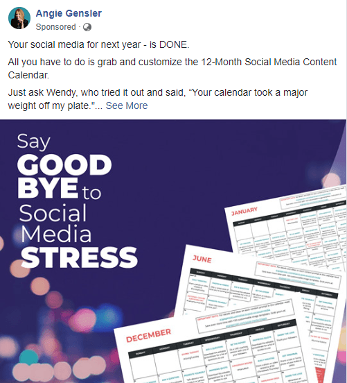
Angie Gensler is a Social Media and Digital Marketing Coach. This is her Facebook ad for a 12 – Month Social Media Calendar. By using a softer shade for the background, the ad copy brings focus to the calendar sheets. The color also conveys luxury and value, referring to how valuable and time – saving the calendar is.

Bolt IoT is a company that offers certified courses in on – demand technical topics. The first thing we notice is the focus point, that is clearly highlighted using a mild shade of the color. In the background, we notice the use of different gradients of the blue color spectrum, symbolizing technology. The ad copy is very simple and direct, conveying the point across in a clear manner.
PINK
Traits associated with this color:
Long term, Feminine, Care, Assertive, Sensitive, Nurture, Unconditional Love, Calm, Respect, Warmth
Brands that use this color:
Barbie, Cosmopolitan, Victoria’s Secret, LG, Axis Bank, ELLE 18, Babyhug
What it does:
Pink is a symbol of love. Although it is argued with red, red can sometimes mean dangerous whereas pink represents positive feelings (Motherhood)
Lightens the mood and destresses (Therapy Centers and Fertility Clinics)
Creates a sense of individualism, comfort and celebration (Clothing Brands and Salons)
How it can be used:
Great for ads on motherhood, parenting, Self – Care, Fashion and Styling.
If your brand color or your ad background has a darker tone to it, using pink for CTAs can help in balancing the overall intensity.
Pink can be used as a great font color, that is easily visible but not too bright.
Examples

Shopclues.com is a store that sells gift articles and accessories. In their carousel ad copy above, you can find the use of pink color for borders, representing love and fashion to some extent (to represent their bag and shoes collection). This also goes well with their theme ‘Birthday Gifts’ ( celebration ). They have used pink as their font color to highlight the price of the gifts.
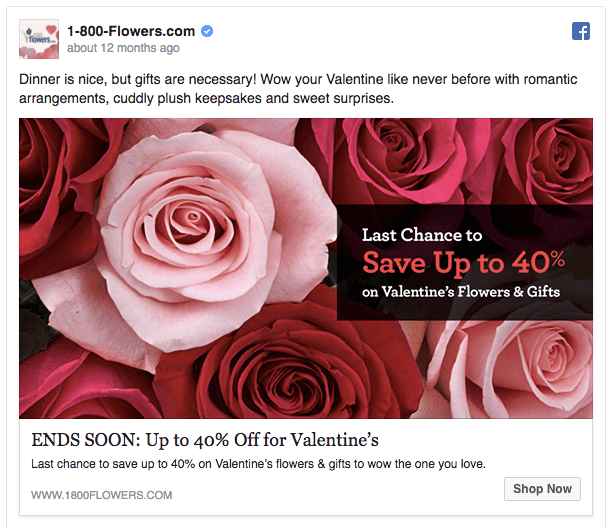
1800 Flowers is a Floral and bouquet shop, that is running a Facebook ad for their Valentine’s Day offer. This ad is the perfect example of incorporating colors with only pictures. By using the picture of pink roses, they are showcasing the feeling of love, care and celebration. They have also used a complementary black color that goes against the primary pink, to highlight their offer.
WHITE
Traits associated with this color:
Purity, Light, Clean, Sterile, Innocent, Spacious
Brands that use this color:
Crocs, Tesla, Cotton, The North Face, Mini
What it does:
Closely associated with Cleanliness, Purity, Professionalism and Safety.
It projects an absence of color or neutrality
Helps to trigger and spark creativity, since it can be perceived as a clean slate.
How it can be used:
Can be used for borders and backgrounds plainly or with design patterns
Great option for sophisticated products and brands
Adding a white gradient in an ad copy filled with bright colors, helps toning down the overall intensity
White color can also be used to convey your professional brand ethics.
Examples
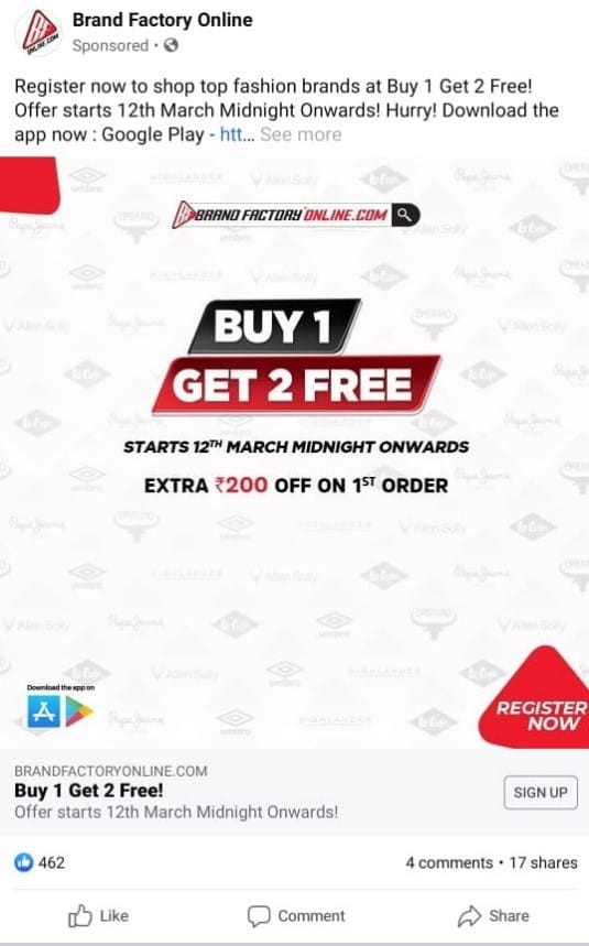
Brand Factory is a clothes and fashion accessories store that promotes their seasonal offers through Facebook Ads. In the above ad, we can see how the company has smartly used white for a neat background and red for the CTAs. In order to avoid a plain white background, they have mildly added the logos of the various brands that they supply. Therefore, the ad copy conveys all information in a very clear and organized manner. This a great strategy to make a minimalistic ad design speak volumes about your brand.
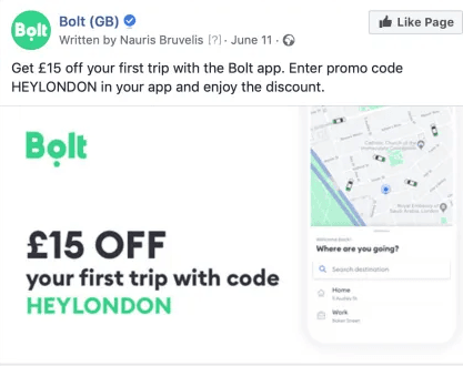
Bolt is a ride – hailing app that is running a promotional campaign. With white as the primary color, along with black and green for text, they are able to communicate trust and professionalism. Their design is clean and comprehensive.
BLACK
Traits associated with this color:
Mystery, Elegance, Rich, Luxury, Sleek, Permanence, Intellectual, Sincerity, Powerful, Authority, Stability and Strength
Brands that use this color:
Apple, Gucci, Adidas, Nike, Sony, Chanel,
What it does:
Gives a sense of Luxury and Sophistication (Automobiles and Fashion brands)
Provoke feelings of professionalism (when used with white)
Can showcase sincerity and ethical (brand profiling)
How it can be used:
Can be used for broad or narrow borders in an ad copy
Often interpreted as a symbol of intelligence, but can become overwhelming if used to frequently.
Consider black only if you want to communicate your brand as professional, intellect and modern. The color is not ideal if your form of communication is fun, engaging, quirky and enthusiastic.
Examples

Realme is a mobile phone brand that manufactures smart phones at an affordable price. On their Facebook Ad copy, we find that black is used as a primary color, showcasing elegance and a professional outlook. Roughly around the center, we see a shimmer of grey to highlight the ‘6’ in the background (referring to the new model). The grey shimmer also reduces the pushiness of black. The black also helps to accentuate the features and price of the phone.

The Souled Store is an online brand that sells merchandises. The above Facebook ad is for a Batman T – Shirt. By incorporating the color black for Batman, they also convey sophistication and power through their ad. Notice how using black solely without much colors alongside, adds class and brand value.
Some Color Facts, Tips and Trivia
Here are some facts about certain colors and combinations that have not been discussed so far
Brown can convey a sense of relaxation and calmness. Hence, it is often used in coffee, chocolate and furniture brands.
Use grey or silver in your ad copy, if you want to communicate Balance, Neutral, Traditionalism, Conservatism or Style. Do note that excessive use of this color can give a depressing tone to the ad copy (Since, it is also associated with old age)
Combination of black and white is a great alternate to grey, since it also conveys the similar traits.
Using a sole color throughout the ad can actually do more harm than good. Use the right shade and complementary colors to make your ad stand out.
Understand and figure out the right gradient of the color you plan to use. In some cases, a darker red shade looks better than a bright red. Using the wrong gradient is equivalent to using the wrong color.
The post Psychometric Analysis of Colors in Facebook Ads appeared first on Social Media Marketing Tips | Digital Marketing Blog India.
Article Source and Credit soravjain.com //www.soravjain.com/psychometric-analysis-of-colors-in-facebook-ads/ Buy Tickets for every event – Sports, Concerts, Festivals and more buytickets.com